Last Updated on June 26, 2013 by New-Startups Team
When designing a website, app, editorial or anything else getting the layout right is of the most importance. The user interface is essential to correctly convey emotion, calls to action and information for the end product. There are many kinds of design layouts one can embark to deliver, but for all of them the main task is to make it understandable for the user.

One of the reasons for intuitive layout design is to provide the user with confidence in that what their using is correct for the application. If that confidence is lost then the product becomes a clumsy project, which makes a user not want to use it. The UI is the initial decision maker for a sticky website or application, the user wants clear identification of what to do, not a haphazard experience.
Grids are a well-known design mechanic that gives users confidence that thought has been put into the interface. It makes one believe that the structure of the site or app is with apparent reason only heightening an experience. For a designer grids are another tool to help achieve their goals by providing a reference to work with.
Even though grids are incredibly helpful, grids should be utilized as just a reference. When held to as a restraint, grids can disturb creativity, but when utilized in the right way grids help you to attain design goals not limit them.

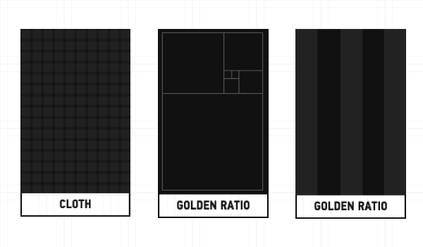
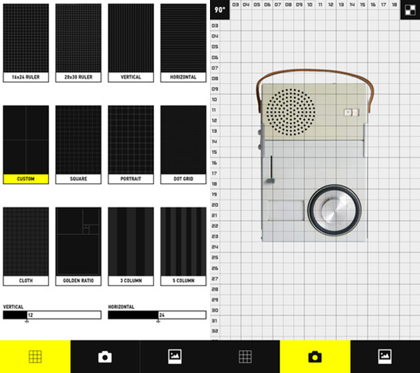
Grid is an iPhone application that allows you to see the grids of visual materials through its 12 different grid structures. Grids can be applied in Photoshop and other creative software’s, but this application lets you take any image and see the reflective output on your smartphone itself. May it be the Golden Ratio, 10×15 square or vertical composition, the app lets you decipher your design, photo’s, architecture or industrial design drawings quickly to ensure your grid design is helping the user and not limiting design.
“The grid system is an aid, not a guarantee. It permits a number of possible uses and each designer can look for a solution appropriate to his personal style. But one must learn how to use the grid; it is an art that requires practice.”
Josef Müller-Brockmann
Grid, structure, systems, and foundations are all words you hear about when describing this tool of design. They are impactful words but feel un-creative, in reality that isn’t the case, they are intended to be useful tools to aid design goals while keeping things fluid. The Grid app provides a useful tool to see your designs and how they perform, but it’s just an alignment that is suggested to be followed that is allowable to be cracked when the design calls for it. Grid’s do provide a basis for creating results and provide confidence in a user, try out the Grid app next time you build a responsive website or are testing an app to see if what you provide helps a user perform what you intend them to do.