Last Updated on August 2, 2018 by Tim
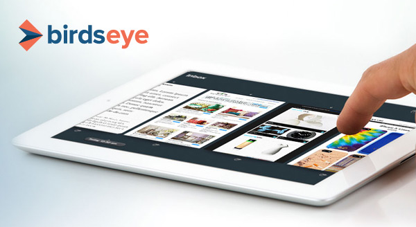
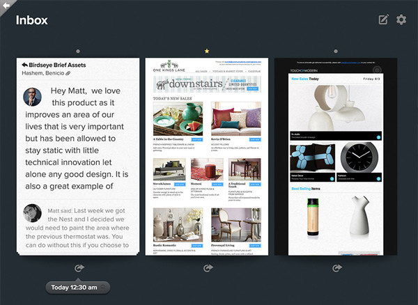
Reinventing the email can bring crowds of success and accolade; just ask Mailbox and Sparrow. Birdseye knows this too, and Birdseye wants you to know it can make a difference as well for those that attack emails on a tablet. Built specifically for the iPad, the application takes a visual way to display email to cut through the overload feeling of traditional table based listings.

The iPad app for Gmail took a ground-up approach in development because quite simply “email sucks” on the iPad. Most applications adapt what they build on desktop and smartphone to be similar in experience on a tablet, that’s not how it should be done according to Birdseye. The way we interact on a tablet is totally different from a desktop or iPhone, and those design decisions should not be the same across all devices.
Birdseye uses the iPad’s advantages to build out a functional interface by working as a visual dashboard, using large boxed items for viewing and streaming through, and elements can be manipulated by a touch. In Birdseye emails are shown as large tiles that can be swiped through, rather than the usual tabular subject lines found on email clients. Images attached to emails are preview displayed quite large and content is stripped of needless items at times to provide the best preview of what’s inside possible.

Birdseye is still a developing application and while for many iPad hasn’t been the choice for dealing with emails; with Birdseye the iPad becomes a usable device to make dealing with emails not suck.